
7 Sisters - Corrections
See the first post about the 7 sisters here
I did a valiant attempt at creating watercolor clouds…but they refused to turn out. Learning lesson that I should really learn more about how to do cloud formations with negative space, and that I should do the sky FIRST. I do honestly find sky painting with watercolor a bit…boring.
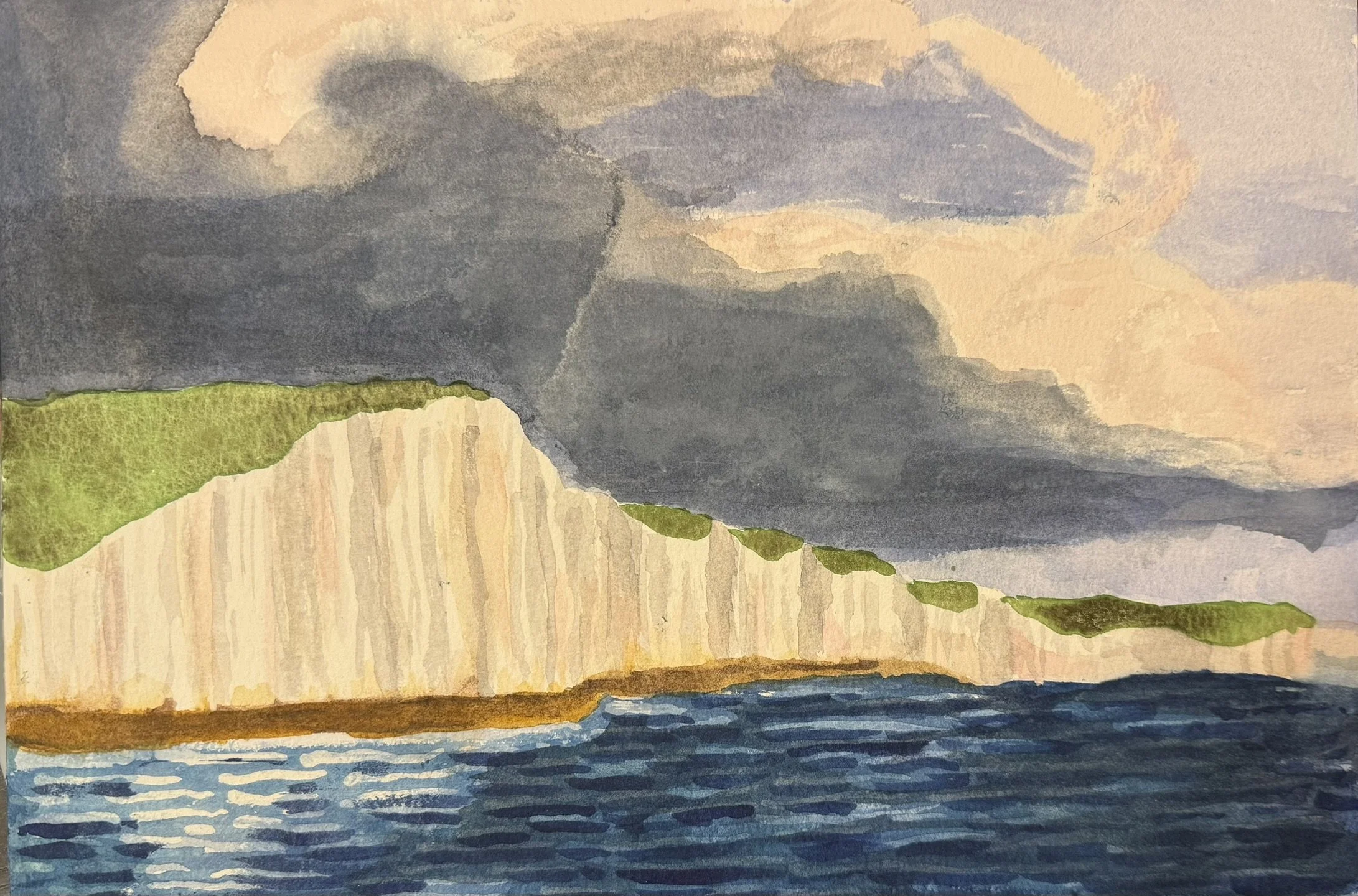
I did try a few things…but clouds have always been a weakness of mine…even digitally. The only thing I knew what to do was bleed color into white space, which you can see on the top left…but this method didn’t quite reproduce smoothly on other areas…and as you can see I created some lines which look like tears on the paper (but are thankfully not so).
Something I did enjoy was using Green Apatite Genuine for the grassy hills…My reference photo depicts the browned grass of winter…but I wanted a bit more color for my sisters so I used the brown granulation effect of the Green Apatite on my rough textured paper. You can see a more concentrated section on the last two sisters on the right.
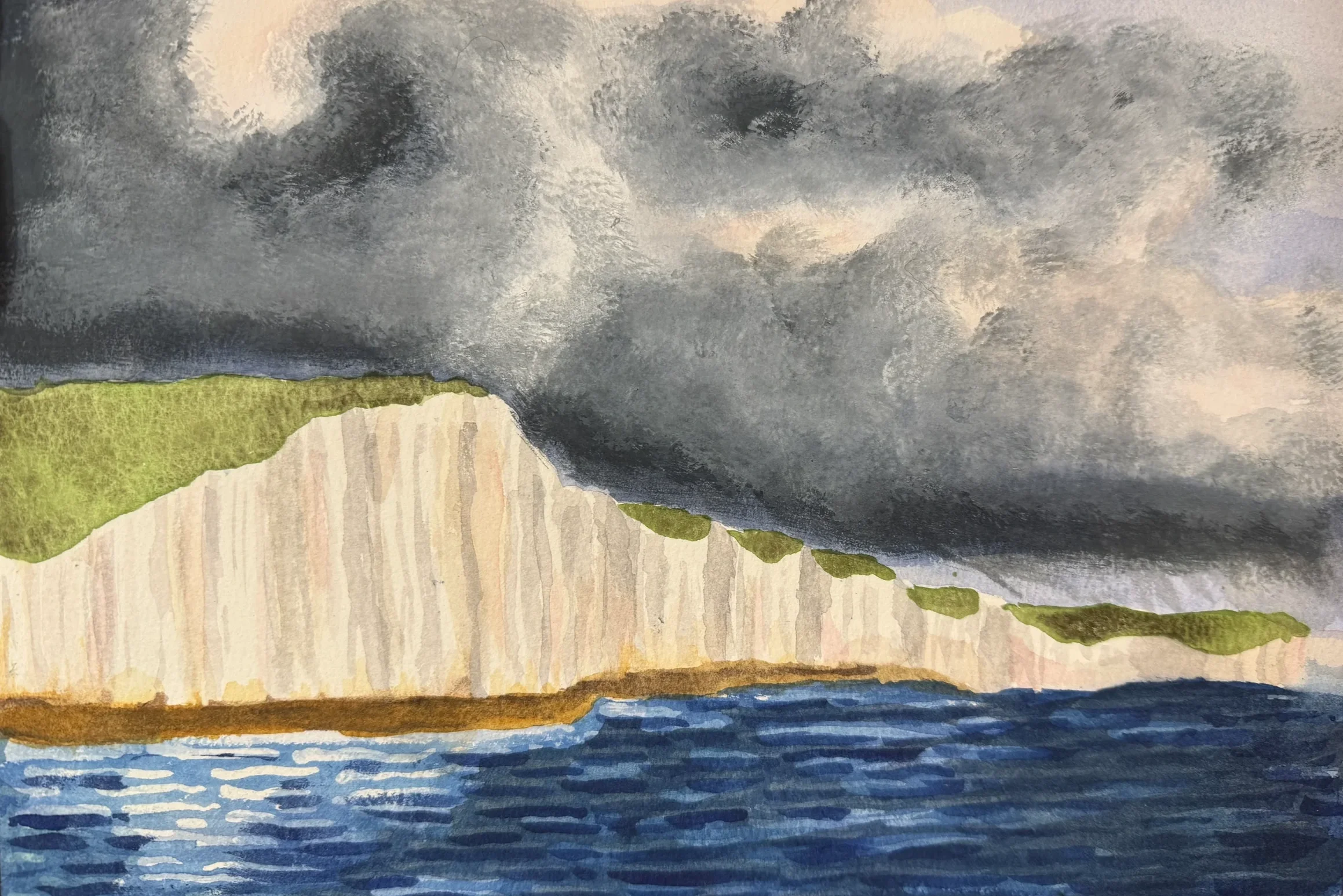
Gouache Clouades
Thank goodness for my illumination Gouache: pronounced Gwash - I even wrote ‘Gwash’ on my Gouache container because I had lots of trouble remembering how to pronounce the French ‘oua’ (French being another weakness of mine).
Several criticisms I had on my worth thus far:
The water saturation does not reflect that of the sky. The intense phthalo blue makes it almost seem like tropical waters - but water should reflect the colors of the sky. I need to saturate my blues to do that.
The lovely green appetite of the hills should be mostly in shadow
The white of the cliffs is too white for a cloudy sky. I’d like to add more contrast.
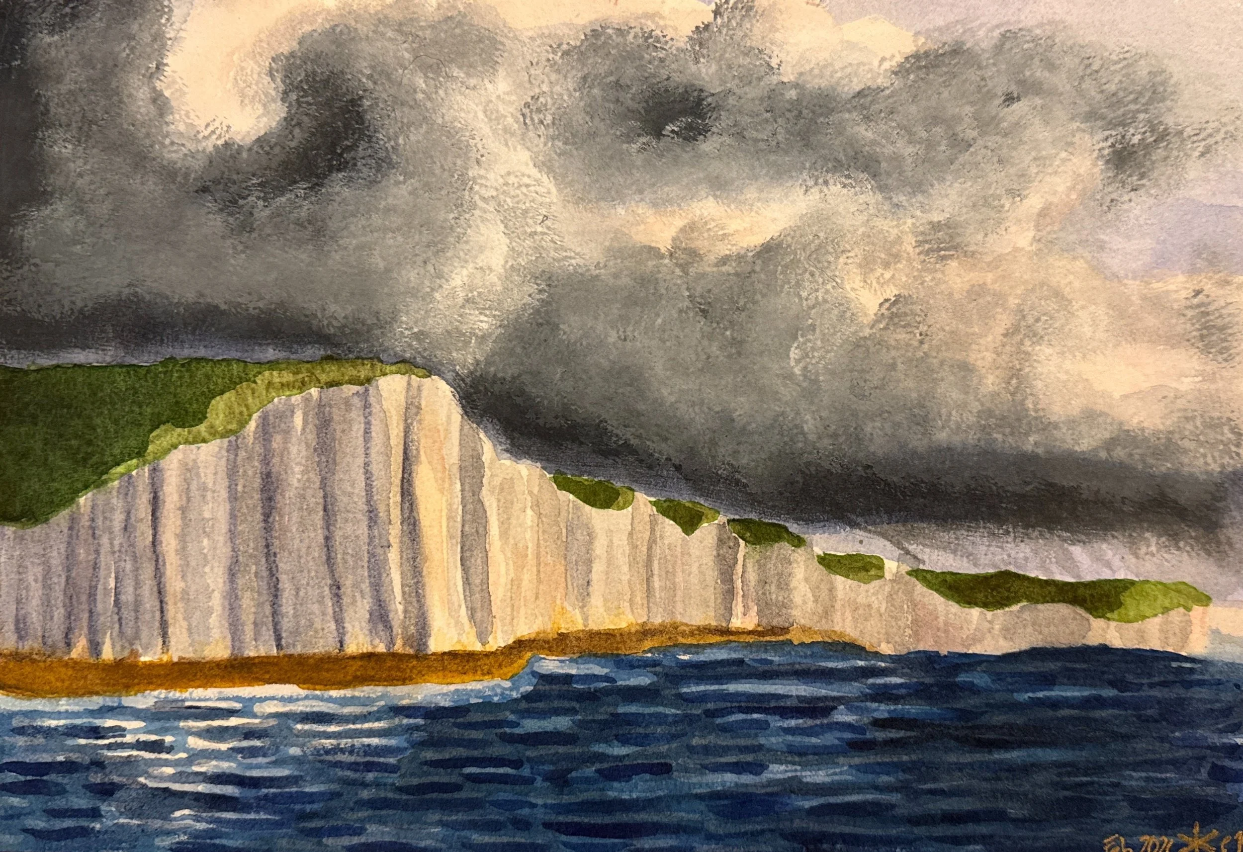
Shadow Play
I added some blue-grey shading to the left side of the cliffs and some warmer greys to the right. I also added a bit of blue to the green apatite to create a dark and more blueish cloud shadow to the cliff greens. I also added some dark blue-gray to the right side of the ocean - using some negative space painting to allow some lighter hues to show through
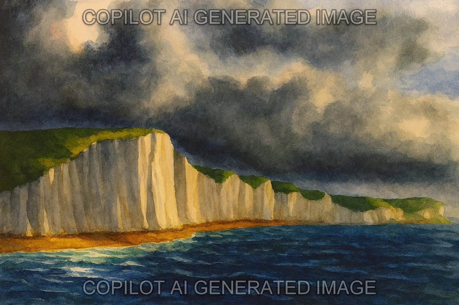
The way I use AI in art.
I absolutely hate the AI slop infiltrating the internet. I hate the way AI writes - even when I spend ages attempting to train it to my standards where every word needs to earn its place. Alas do not expect this type of writing in these blog posts about art - at least not yet.
I don’t have a reference photo which shows the type of brights with cloud shadows on the cliffs which matches my image - so I did ask copilot to take my picture and attempt to improve it with some natural looking shadows.
This is NOT my art. I just want to show how I think I can ethically use AI as an assistant for my art - never to replace it.
And yes - it absolutely can be frustrating when I feel like its image is better than mine - but I can compare it and figure out WHY it looks better - and make improvements from there.
Also - I used some color theory terms in today’s blog - so I may as well paste a quick glossary of terms I may use in future posts:
Hue The basic color family (e.g., red, blue, yellow)
Tone A hue mixed with gray; affects mood and subtlety
Shade A hue mixed with black; deepens and darkens the color
Tint A hue mixed with white; lightens and softens the color
Value The lightness or darkness of a color (independent of hue)
Intensity Also called chroma or saturation; how pure or vivid a color is
Temperature Perceived warmth or coolness of a color (e.g., warm reds vs. cool blues)
Pigment The physical substance that gives paint its color
Complementary Colors opposite on the color wheel; create contrast when paired
Analogous Colors next to each other on the wheel; harmonious and unified
Split Complementary A base color plus the two adjacent to its complement
Triadic Three colors evenly spaced on the wheel; vibrant but balanced
Monochromatic Variations of a single hue using tints, tones, and shades
Color Harmony Pleasing combinations based on relationships on the color wheel
Contrast The difference in value, hue, or intensity between elements